Regular readers of my other blog know of my unhappiness with how the red peonies show up in photographs. Until recently that meant digital photographs.
The problem is that the red peony is a deep dark rich red, and as the blooms unfold, that red stays the same. Until, that is, the sun hits them, then there is a strong magenta tint. People looking at them say it's sort of a purplish red. I am not going to dive into the details of how camera sensors, filters, and software create a colour image.
In digital photos it transitions from a red to an ugly magenta startlingly quickly. In addition, depending on exactly how the light reflects off the petals, it's really easy for the highlights to be blown out entirely. I end up under exposing the whole scene, and usually end up doing colour manipulations in Lightroom to keep it under control, with mixed results.
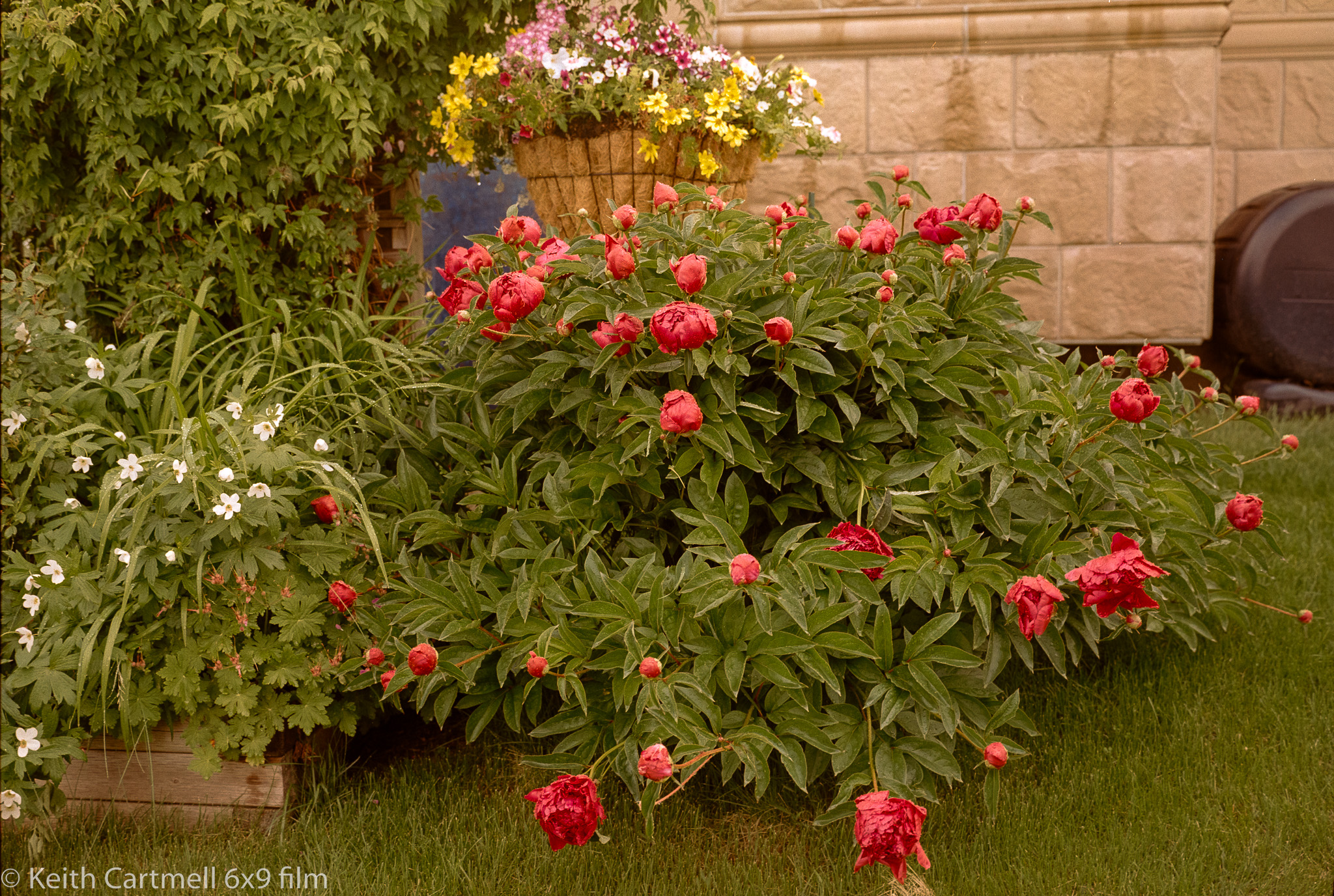
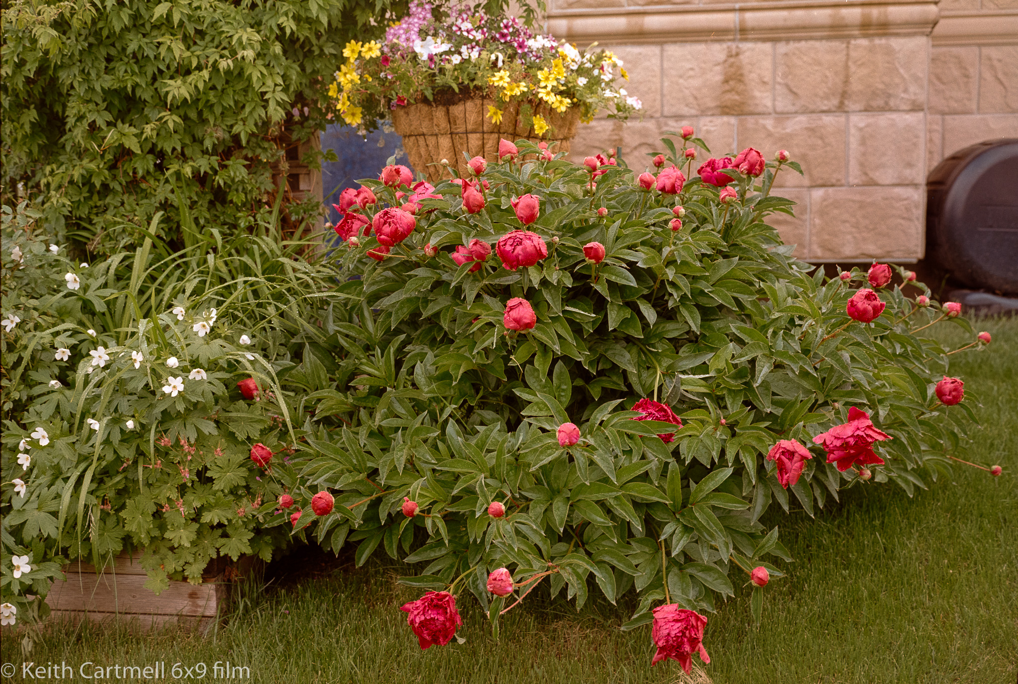
Then I started shooting film, and was really curious how the red peony would show up. Here's several photos from the GW690 using Kodak Gold 200, scanned with a digital camera and lightly processed in Negative Lab Pro. Note that I'm still figuring out this software, and some of the sliders are extremely sensitive at various places. They can very quickly go from no visible change, to no visible change, to I think I see a slight change, to good golly that's horrible. In Lightroom doing anything more than cropping and removing dust spots is fraught with frustration because everything is backwards and the results can change just as quickly as in NLP.
1A and B. The blooms appear to be a bit of an orangey-red to me under overcast skies. Slightly different processing trying to get the stone wall right. I think B is closer, but there wasn't much effect on the blooms.


5, 6, and 7. Digital, after a LOT of editing, and I'm still not happy with them.
No matter what I did I couldn't get rid of that magenta, and in this light my eyes didn't see any when taking the photo.

Still too bright.

The best of the digital bunch, I think, but it still doesn't look right. That grass is much too green and the red is too bright. It sort of looks like why many people don't like HDR images.

The film red isn't quite right either, but at least it looks more natural to my eye, and the transitions are much gentler.
As a bonus, here's a nearby pink peony.
8. Film, still Kodak Gold 200. This is much closer to the actual blossom colour.

9. Digital, shot a few days earlier. This pink is a little lurid but the stone wall looks about right.

So. All in all, if I was using film anyway, and happened to include the red peony for whatever reason, the processing for it would be no different than any other scene. Generally with film one tends to err to overexposure, but not with the red peony. At least my limited experience says so. Whereas digital red peony photos require a lot of care to capture, and even more to process.
No comments:
Post a Comment
Looking forward to reading your comments.