There's a couple overlapping stories here, and I've been unsure how to tell them. So let's start with with the event itself, and when it veers into film stuff, the readers not interested in film can stop. How's that for a deal?
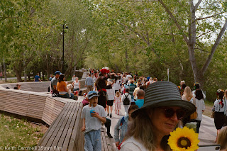
My friend (which is a simple word for a multi-faceted relationship) Michelle recently (in the great scheme of things) got several tattoos done by a talented Ukrainian artist. Anya told her about a downtown walk to fund raise for Ukrainian war relief efforts. I heard about it and thought it would be a great way to try out the Canon 7 and Fuji Superia 200 colour film in an urban setting.
A short digression. I don't have any Ukrainian ancestors, as far as I know, but I'm still horrified by what is being done to Ukraine. My massage therapist has Ukrainian ancestry, and I've donated some money to her, to flow to aid efforts. There's a lot of personal initiatives to funnel money to various forms of relief. Whatever works.
We met up with the group, and tried to ignore the very bad Christian rappers importuning the growing crowd. I don't know if that's their regular beat, or they knew of the walk and decided to try to convert some souls. They were not successful. It was very bad rap.
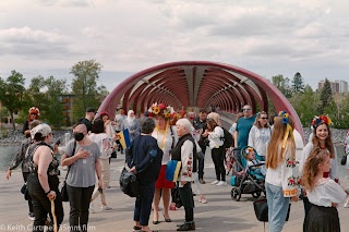
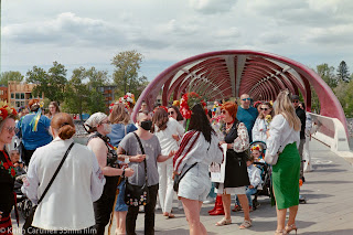
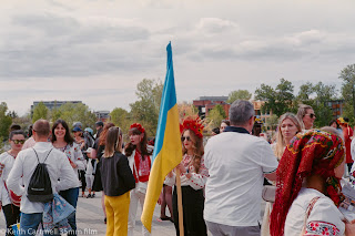
I loved the colour and intricate needlework! They sang as they walked, and though I didn't understand the words, I could tell it was deeply meaningful to many of the walkers. A few of the photos worked out. At the end M and I went for a fancy ice cream cone, and did some further strolling and more photos. Because taking photos of M is such a hard thing to do.
1.
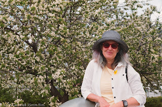
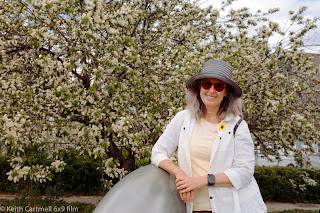
I'm mostly pleased with the colours coming out of the Superia 200. Look at the red of the bridge in photo 7A, that's pretty close to the colour it actually is. The rich yellow and blues came out quite nicely, and the green of the trees looks right.
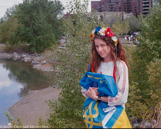
However, that film hated Michelle's skin. That's one of the complicated film things. The two A photos below are the Superia 200, and I had to work hard to get her skin to come out even this nice. Given some selfie experiments yesterday with my face, I can only imagine how badly that film would treat my skin. Yet, scroll up again and look at the woman in photo 4. I didn't do anything special in editing, and her skin looks great.
The other complicated thing is converting the negative to digital. In simple terms, I take a photo of the negative with a macro lens, and normally it is simple. The negative goes into a holder that is supposed to keep the film flat. Click, done. Most negatives are pretty flat so it isn't hard.
Except if the film isn't flat, the digital camera image will be out of focus or distorted. That's what happened to many of the photos from the walk. This film curls hard in 3 dimensions. It curls up like it was in the little canister it comes in, it also cups from side to side, and worst of all it twists longitudinally. (No, I don't think the lab would have done anything different with this film, compared to other films.)
I also think it's a fraction of a mm narrower than other films, which makes it even harder. It is brutal to get it flat in the holder. Some of the shots I could tell looking at the negative they were out of focus, so I didn't mind those. But the rest of the shots just weren't good photos (again, my bad), so I wasn't going to the frustrating effort of getting them into the holder properly.
I've got two more rolls of the Superia 200, and quite frankly, I'm not interested in putting them in the camera. If any of my film buddies wants to have a go, get in touch and we'll go for a walk. If you develop your own film, maybe there's special tricks to tame the curl. Or maybe you use the anti-Newton ring glass trick for digitizing. Get in touch, I'll give you a deal.
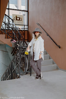
So what's the B photos, you ask? Those are Kodak Gold 200, shot on the GW690. Again, these are not meant to be a direct quality comparison. There's very little editing done to these photos, and nothing special done to her face. The red of the bridge is slightly more orange, but that might be an exposure thing, and could probably be tweaked in editing.
8A.
9. One last shot with Kodak Gold 200 for today. If you remember the May Image of the Month, here's another view of that space.



Interesting compare and contrast, Keith. I think I have the same hat as Michelle.
ReplyDelete