Saturday, April 23, 2022

First film portrait attempts with GW690

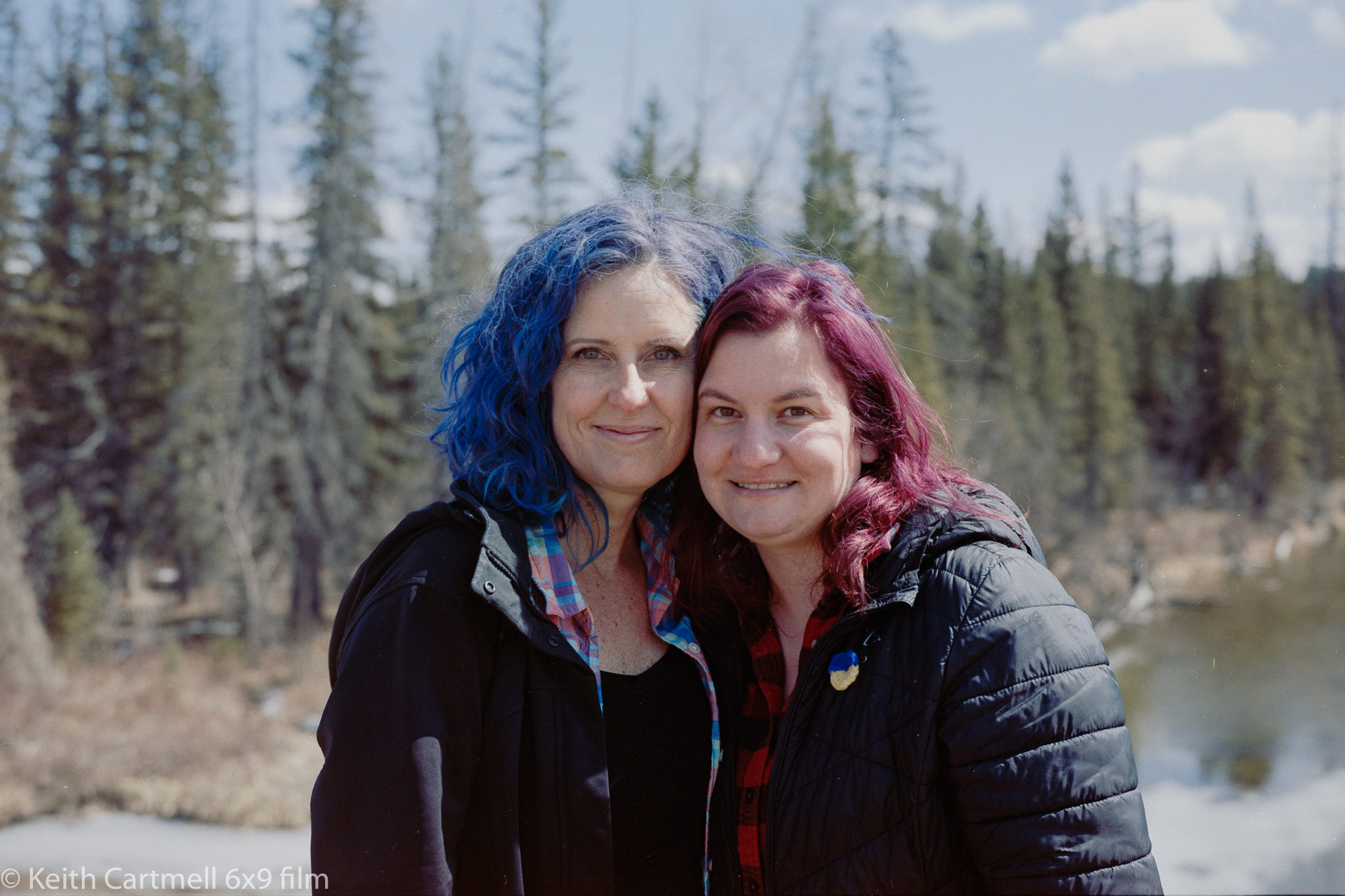
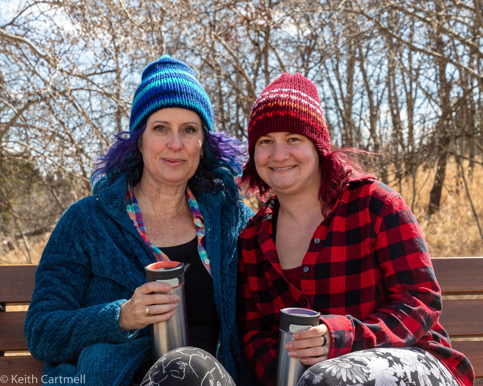
 I was curious to see how the film camera worked out for doing portraits. The reviews say that because of the 1 m minimum focussing distance and slightly wider than "normal" field of view, it isn't good for tight head and shoulders shots, so I was looking to see how much background there was. My thinking was a portrait of a person in their setting. With any luck an interesting background can enhance the interest in the person.

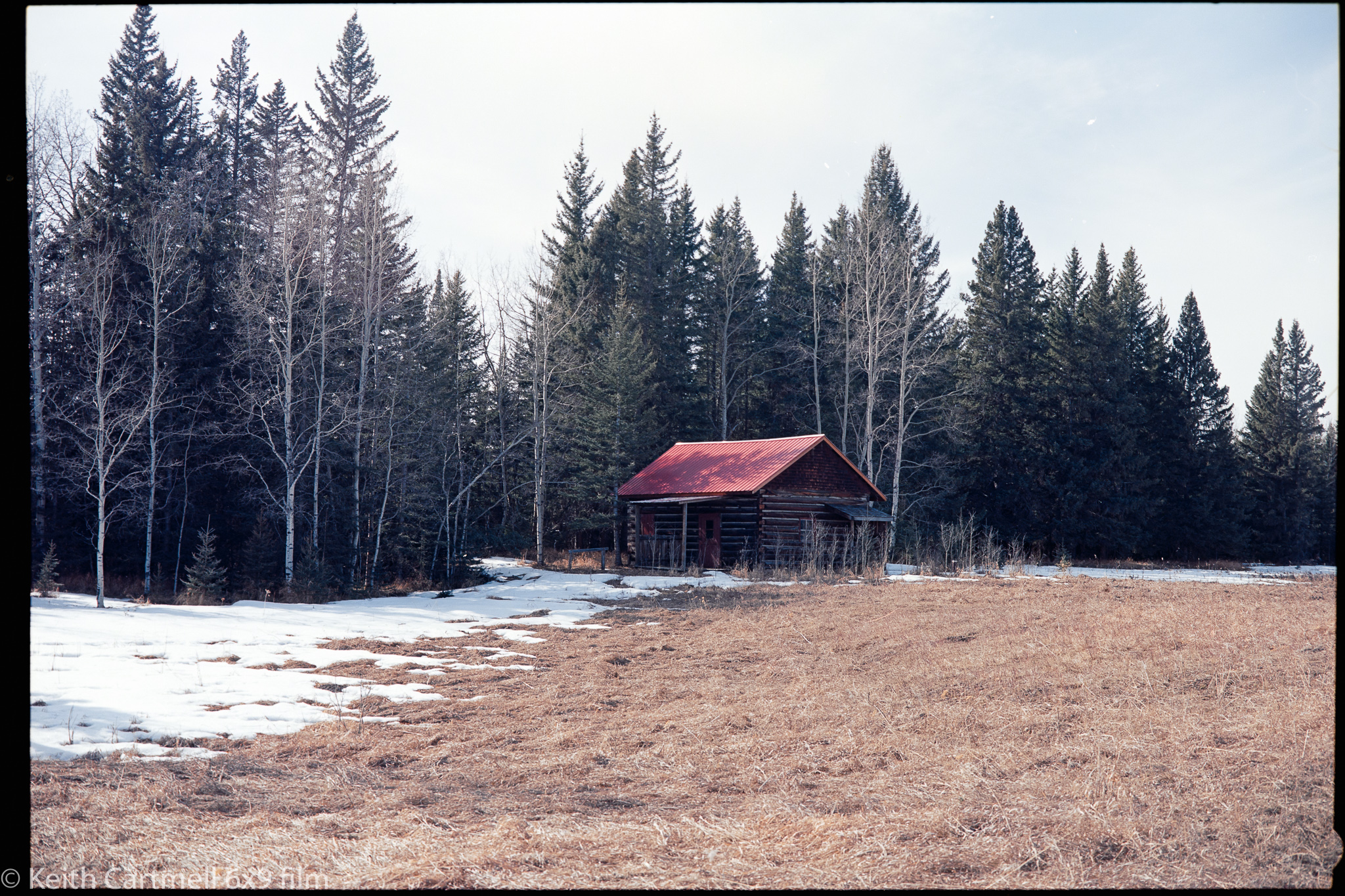
This matches up to one of the original purposes for the camera, back in the day. Part of the tourist industry in Japan was to have a bus pull up at scenic location. Photographers using this or a similar camera would line up groups and include the scenic background. Then the film would be developed and the tourists would be able to buy a photo of themselves at the various locations. There was even a special roll of 120 film with only 4 exposures, so I'm guessing they did one group, changed the roll, then another group. It seems a pretty safe assumption they got really good at changing film. 

But you've got to walk before you run. Once again I'm grateful that Michelle was willing to pose as I figured out settings, and for the indoors portion, lighting. Her (and my) friend Antje came along as well. I took some digital photos along the way, just to see how they looked, but not with the intention to be directly comparable to the film shots. In one specific case, I wanted to see how the red fringe on a costume mask would look on film compared to digital. I've never been happy with how digital handles the particular red of our peony, and the mask is a similar colour.

The outdoor shots turned out fine, using Portra 160. The sunlight was pretty harsh, so a translucent reflector to soften the light would be good, or maybe a white one to fill shadows. Then again, I could have moved us into the trees. I just missed focus on a couple of shots, but learned a trick to help with that. I got them to hold a finger vertically right beside their eyes. That makes it easy for rangefinder focussing, and the only remaining thing is to ensure there's enough depth of field to include hair and the tip of the nose.

1. This was the harsh sunlight shot. I might be a bit overexposed here, since the grass is quite a bit more gold than the film shows. 

2. Michelle suggested a climbing out of the valley shot. I was getting set up for it when there was a squawk from the hidden model. She was about to lie down on a busy ant hill. We moved a few feet along the hill and it all worked out.


3. I'm standing about as close as possible to them, using the widest aperture my shutter speed would allow. (Max 1/500 sec). I wanted to see how the trees in the background looked out of focus. The effect is nice, but I think the trees should be a bit greener. Perhaps there is a bit of over exposure here.


4. The red test, film first.

4A Digital. Look at the difference in the red!

5. It looks a little like they were photoshopped into the background, but I assure you, there really is a bench in front of those trees.

6.

5/6 A Digital. I think the digital captured the gold grass better, but then again, when I look at the original, the grass is much the same colour as film. I think it has their complexions a bit more ruddy than they really are Or maybe that's a reflection from Antje's jacket. My experience so far is that digital offers much more latitude for editing than film. I've found pushing the Lightroom sliders for a film shot can get weird really fast.


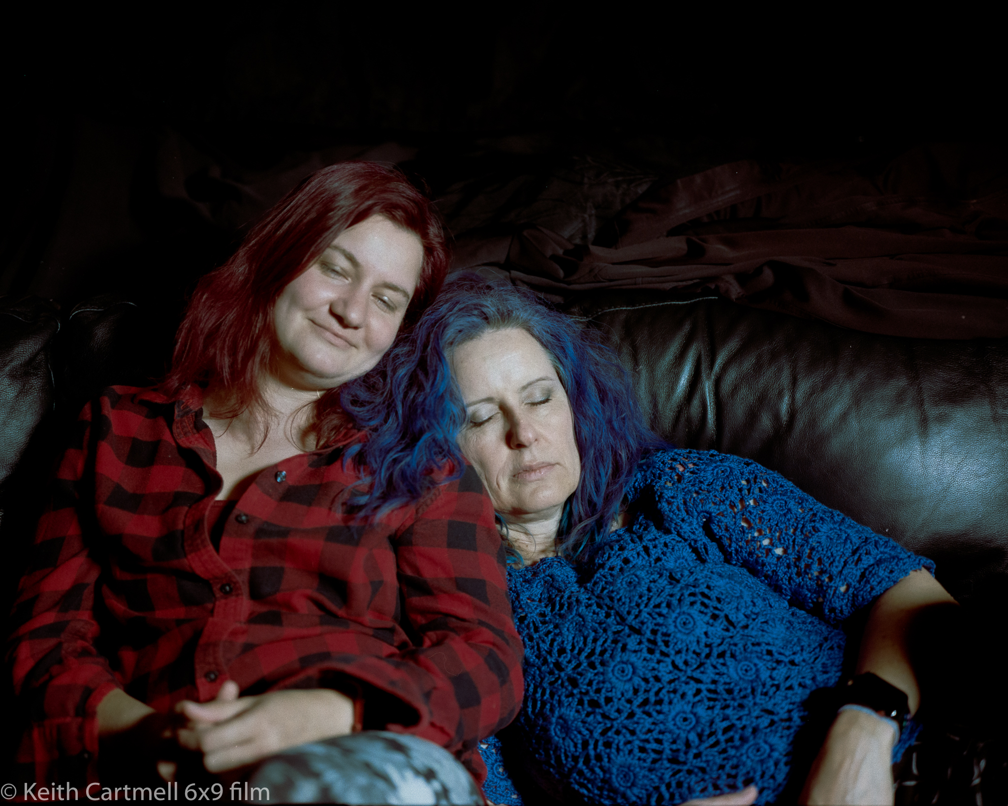
Then indoors, using Portra 400. This was considerably more challenging, deliberately so. They were sitting on a black leather couch, with a dark background. I wanted the background to essentially disappear, leaving them nicely lighted. I actually measured to ensure the lens would focus, and all these are cropped a little bit. 

Overall it didn't work out as well as I had hoped. The LED lighting was a bit harsh on their skin, and I think I over exposed a bit more than the film liked. I'm pretty sure this was a metering error on my part. I'd intended to meter for their faces, but I think there was too much background and it gave me an average number.

7. Loving how that red turned out!


8.

9. These two are not a mistake. The 690 makes it essentially impossible to take a double exposure photo, so I figured out a cheat. This is a 5 second exposure, with me covering the lens at about 2.5 seconds, letting them turn their heads to face the camera, then uncovering it. At 5 seconds I covered the lens again and changed the shutter speed to close the lens. I need to do some changes to the light and timing to get the exact effect I have in mind, but this is a great start.


10.

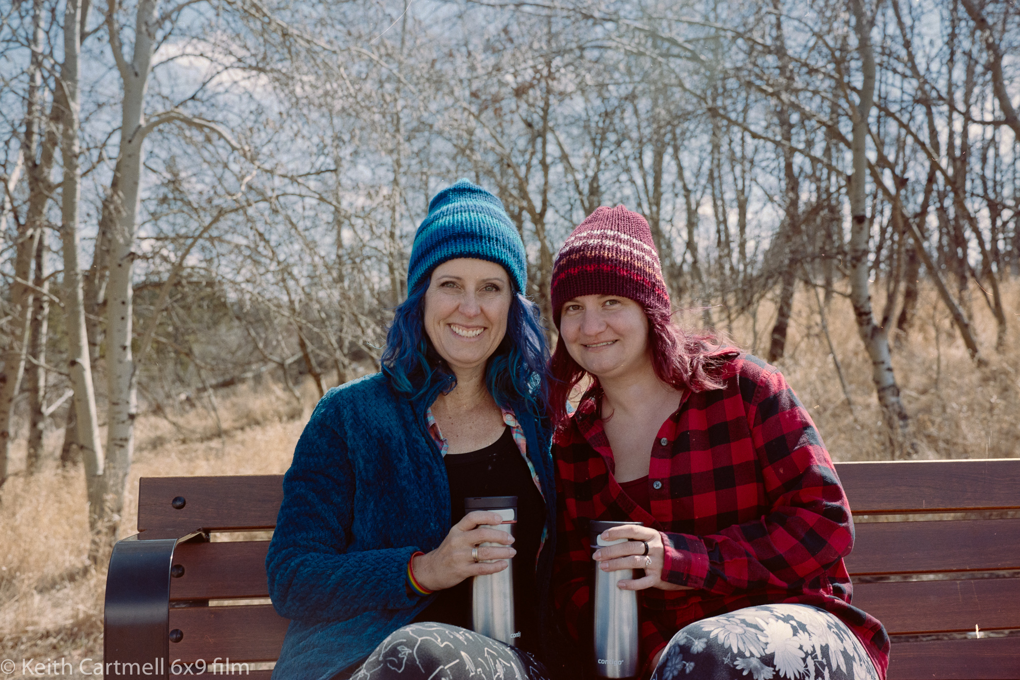
11. They had recently dyed their hair and wanted to show it off. I'm happy with with how their hair turned out, but not so pleased at how their skin turned out.


12.

There is another photo from this shoot that I'm going to address separately, for a couple of reasons. You'll have to stay tuned!

Friday, April 15, 2022

Ektar 100, several trips

One of the limitations of the GW690 is that a roll of film is 8 photos. At best 8 photos. Do anything wrong and you end up with a not-photo. The famous example is a dark square because you forgot to take the lens cap off. Remember, this is a range finder, so I don't look through the lens while composing or focussing. Part of my mental checklist is to take the lens cap off. I usually leave it in the car, if I've driven to where my photo ramble will happen.

Below are the 8 photos from the most recent roll of Ektar 100. This is a film that loves colour and lots of light. Colour doesn't describe a lot of Calgary these days, unless you call white or spring mud a colour.  But part of the process of taking a really good photo is learning how, and that usually means lots of so-so photos. That's mostly what this roll is. Technically they're fine, in the sense that they're properly exposed and in focus. Both of those can be a bit of a challenge. The solution is to not be in a rush.

I'm still evolving my thoughts around why I'd shoot a scene on film rather than digitally. Part of this is learning exposure, rather than the camera telling me what the right exposure is. Part of this is trying to capture images of an idea, or something beyond a perfect technical representation of an object. 

Part of the imperfection is dust spots and hairs on the negative, or on the lens, or on the digital sensor. If you look closely at any of the images below you'll find them, and being honest, you won't have to look too hard. I've removed the ones that I think are a distraction, but that's a never ending rabbit hole. 

Part of this is to embrace the imperfection of film to capture the imperfection of the world. After all, even a technically 'perfect' image is going to be viewed through a monitor or glass that could have spots or stains on it, be badly calibrated, be in weird ambient light, through eye glasses that need to be cleaned, through an eyeball with floaties or cataracts, and interpreted by a brain that might see colour differently than the artist.

So if you've somehow come here expecting to find an image that will make your heart explode with joy, I'm sorry to disappoint you. Carry on as best you can. I'm looking to make images that will make my heart explode with joy.

1. Quirk Creek Gas Plant. You might remember I tried to shoot this earlier, and it didn't work out. What's interesting is that I  know there's more detail on the negative that in this photo of the negative, specifically in the white part of the material of the stack. Maybe I'll try to get a more detailed image of just the stack and plant by shooting the negative again, rather than just zooming into this image. (Hint, I tried that, and the white bits of the stack are overexposed in this version.)

One of my thoughts is to revisit some of the negative images, and develop further work from them that is not strictly representational.


2. Same drive. This was an exposure exercise, trying to not lose detail in the deeply shadowed part of the cabin. 

3. A different walk exploring an area I haven't been to for several years. I'll have to go back, there's several more areas to explore from here. This is one that I thought seriously about cropping in.


4. I'm not totally sure what happened here. This turned out very blue, and very hard. Trying to tweak it went bad very quickly.


5. From a downtown walk through the +15 on the way to lunch with a buddy. This is shot through a filthy glass window, but it seems to capture the colours well. This is the shot I'm most pleased with from the roll. I don't know who the mural artist is.


6. Part of the core mall. This is an example where the camera didn't pick up on what I was actually seeing. 


7. I had deliberately composed this so that there was a strong light behind the glass sculpture, hoping the colour would really come up. Instead, the rest of the room seems much brighter than I remember it being, and the colour somewhat more muted. This might be another one where I reshoot the negative, cropping in on the sculpture, maybe trying some different import options.


8. Another filthy window shot, hoping there would be a reflection layer showing up. I can sort of see it, but then I remember the original view.


What's next? I loaded some Portra 160, thinking my buddy might be up for an impromptu photo session, but no. The office called. There is another portrait session being flanged up. As always, stay tuned.

Sunday, April 3, 2022

The most thoughtful photography book yet

 There are lots of photography books in the library. I've been taking a few at a time out over the last several years. Mostly now it's rare to find one I haven't seen, so I've taken to searching on line and putting a hold on the promising ones. That isn't as much fun as browsing, but it's better than travelling to the other branches. 

Or is it? I'm just now looking at a map of the city libraries. At one time long ago, I'd been into every library in the city. Now, hmmm, what with growth, new buildings, I can only recall being in 4 or 5 of them, out of 21. Maybe it's time for a road trip, and how appropriate would it be to take the camera? A few of them are in parts of the city I've never been to, there's been so much growth. For those that don't live here, Calgary has essentially doubled in size since I came here in 1980. There is lots of sprawl, and much of it is ugly. 

But back to the books. There's several different kinds of photography books. How to, travel, landscape, wildlife, portraits, and biography quickly come to mind. Of course there's some cross-over, such as travel and wild life or landscape going together quite well. 

The kind I'm most disappointed in are the ones that purport to help you become a better photographer, and it's a cookie cutter paint by numbers approach. Here's the rules. Here's an image, here's the settings I used, and maybe a bit about the editing. Do that and you'll get a good photo. Except, not. Out of all the things that make up a great photo, the specific camera settings are probably the least important. Lots of great photos break all the rules, yet grab you by the yarbles, and then those elements become an addition to the rules.

Some of the books talk about the art of photography in great detail, comparing various photographers, how the art has evolved over the decades, discussion of the various 'schools' of thought.  They do a scholarly deep dive and to get the most out of it you need to already have an art background. This can be interesting in places, but often it seems pretentious. Don't get me started on the drawbacks of scholarly or intellectual writing.

Photography has changed quickly. It wasn't so long ago that photography wasn't even seen as art, and then only black and white was art, then reluctantly colour was accepted. The only practical way to capture images was on film, and the way most people saw the photographs were in magazines like Look or Life. Then digital came along and for a while there was a book genre that compared film to digital and most of them were out of date by the time they were published. Like computers, which is essentially what a digital camera is, digital cameras got better astonishingly quickly. I used a Sony back in the late 90's that used a 1.4 MB disc as the storage, and it could hold about 30 photos, I think. My camera can hold about 3500 photos (of technically high quality, if perhaps not artistic quality) if I put in the right SD card. Then the iPhone came along, and it's successors and competitors. Now, for most people, for most practical purposes, a phone camera is all that they need. Now, daily, a near infinity of photos are taken, and mercifully, most will never be seen.

Publishers have responded to this by producing books about photography, and photographers have eagerly seized on writing them as a way of expanding their incomes and reputations. There are some exceptions, but generally the authors are better photographers than writers. Since I'm more of a writer first, I pay as much attention to the words as the photos, at least until I can't, for whatever reason. Some of the writing is dreadful. Good thing the library is free.

And then we come to The Photographer's Vision by Michael Freeman. 


He starts with what a photograph is (and isn't), and what makes up a good one and why. I liked this beginning at the beginning, and laying out where he's coming from. There's lots of examples, and there's enough information that you could look up further references. In some ways the book is almost like hypertext, in that there are lots of references to pages you haven't got to yet, if you're reading front to back.  I spent lots of time flipping back and forth. Sometimes this is annoying, in that it might be an indication the book is poorly thought out, but that is not the case here. Photographs can illustrate different concepts, and it can be hard to organize the material. I was finding it interesting to think about how the concepts applied in different contexts.

Like a good photo, the book is layered, with lots of different concepts and points of view in different contexts. There's a bit of history, but it's not overwhelming, or overly scholarly. There's an appreciation of the technical issues earlier photographers faced and overcame. With some of the photos he does a bit of a dive into discussing why they work or why the photographer did it that way. He also places photography and photographs in the larger world, as part of the publishing process that typically photographers have no say in. We take the photos, and an editor decides which get used, and what text goes with them.

The book made me think about my photographic journey. Mostly I've been photographing things, or events, or people, all very much in a "there I was and this is what I saw" context. There's a place for this, but there's deeper levels to explore, and this book has me thinking about that. Somewhere along the line a photograph becomes art. Somewhere viewers stop saying 'ho hum another photo of x', and start saying "wow!" 

All this is from the first read through. It's going to join a select group of books that get a second, even more thoughtful read. I'll probably take some notes. 

If you call yourself a photographer, and you're wondering how to take it to 'the next level' as the marketing drivel calls it, you could do much worse than read this book. Even purchased, the price is many times cheaper than that bit of gear you've been thinking about. It doesn't tell you what to do, or how to do it; rather, Freeman talks about the background to those things; the thinking that goes into deciding what to take a photograph of, and why.

This is the key for me. One can 'learn' something by having someone tell you, but then, all that's happened is that you have been told. It's only when you figure it out for yourself that you really learn. I have high hopes.

Thursday, March 31, 2022

More B&W

A bit over a week ago, Cam and I did a road trip to pick up my new (to me) camera. I put some Acros II 100 into it to shoot on the way home. It turns out I only found a couple shots I liked, but then took it for a walk in South Glenmore Park. I wanted to see how a forested area would turn out in B&W. In the most recent blog you saw the shots of me that Ken took, now scroll down and see the ones I took of them.

But we start with the trip. 
1. f16 1/60 for both of these. This actually took two tries to DSLR scan. Dust, especially in the upper left corner where it's easy to see. And yes, there's still dust specs. 


and 2.


It's obvious I edited them differently, even though they were shot within a few minutes of each other. I'm still working on my thoughts about editing film. I'll remove the obvious dust specs where they detract from the image, and if I like it enough I'll reshoot it if I have to. So far I like showing the full negative but that's not always possible. Stay tuned for further thoughts as they emerge.

For those that insist on comparison, here's what it looks like in colour, with different focal lengths and exposure.
3.

4.

In South Glenmore park I chose to stroll along the paths along the hillside, wishing I'd brought traction aides in some places. The path itself was icy, with the areas beside it clear of ice, but full of brush. The light was really nice through the trees, though it made for tricky exposures. I usually double checked with the light meter. 

5. f11 1/125  I liked the crossed trees and sense of depth. I wanted as much of the background in focus as I could.


6.  f5.6 1/30 This was a bit of a gamble. I was trying to balance getting everything in focus, but not too slow a shutter speed, and not knowing how it would look.

7. f4 1/500, loving the strong contrast in the bark, and wanting to see how the out of focus areas beyond looked. If anything the dark areas of the bark were darker than shown here, but I didn't want to lose the detail in the bark at the top.

8. I think these are a little overexposed, but I didn't note the settings. Still, lots of detail, and it starts to give me a sense of how portraits are going to work out.


9. In a digital photo I'd probably have cropped this in bit, and might still for this. However, I like the sun and moon motifs balancing each other. This is my favourite shot of the roll.


The astute of you will note there are only 7 photos from the roll. I'd taken one of some fir trees, but there was a light leak, or a hazy flare across the bottom right of the photo. Plus I think it's ever so slightly out of focus. 

Saturday, March 26, 2022

This time, Ektar colour

This blog is going to be written over several days. If you've been following along you know I purchased a Fujica GW690 film camera from The Film Experience in Longview. Partway through the first roll it appeared to lock up, and it turned out a spring had broken. Considering it's probably more than 40 years old, I'm not terribly surprised. That was replaced and in the mean time I shot several rolls in a loaner GL690, which is a very similar camera. 

There's some photos of my GW here, before the repair, which includes my Canon 6D Mkii for size comparison. On the way home from the first ramble with the repaired GW, I stopped to have a friend take some photos of me with the camera. They'd been curious about it, and this was their first chance to see it in person. There's a yellow filter on it because I was shooting B&W. Thanks Ken!


When you say the film negative is 6x9 cm people say, yeah ok, whatever. But then show them this and they are all holy doodle!


This counter is times 10, not the number of rolls or individual photos.


If there's a way of using the serial number to get the actual manufacture date, Mrs Google hasn't been able to find it so far. As should be clear from the photos, this is a used camera. There are wear marks and scratches, but it doesn't look like it's been abused. Hopefully it's previous owner or owners treated it well. I almost prefer it like this, rather than new out of the box from some hitherto unknown storage container. It has more personality this way.


So now I'll go back to a mostly chronological order for the photos. This is the new Inglewood bridge during a photo walk with some buddies. Portra 160 on the GL690. I call this sort of shot 'there I was and this is what I saw.' What I really wanted to do was find the spot in the middle of the river where the two bridges would frame one another. As you can see, trying that would be a bad idea.


The day before I picked up the repaired GW690 I took a walk along 17Ave SW after dropping off tax documents to my accountant. I had Ektar 100 loaded, and was looking for colour on a bright sunny day. I chatted with a couple people along the way about the camera. That doesn't happen much carrying around a regular Canon digital camera.

With one exception these are quite lightly edited. The dust and hair behaved itself so there were only a few corrections there. My trouble this time seemed to be getting the negative in the carrier lined up with the camera frame. Plus a bit of getting the camera itself level while shooting, which explains some of the irregular cropping. I have one of those little 3 way bubble levels that fit in the shoe, maybe I should put that on the camera for rambles.

I love how the colours popped here! It's almost brighter than I remember seeing. Pity there was a car parked where I needed to stand to square up the composition.


A little over exposed, so I tweaked it a bit to tone it down, but it still looks washed out.


Two views of a mural that I quite liked. The one with the building reflection was actually taken first, then I took up a space in the parking lot to get the second shot, which I like better. It's a good thing the guy trying to park wasn't really hungry. I think I dropped the shutter speed a stop here or the light bounced off the building a bit differently. I don't know the name of the artist that did the mural.


Even lighter shades show up nicely. I had taken a quick shot of a school bus to see how the bright yellow turned up on film. I was quite pleased with it, a very realistic yellow. Pity I slightly blew the focus. It reminds me once again that focus is quite sensitive on this.


I'm finding portrait shots tricky, particularly looking up. I should have been stopped down a bit more on this, which might have got the trees in focus. I was working on the balconies about half way up for focus, and I can see now that's incorrect. Not sure what's happening with the blue fringe at the top of the clouds. That looks a bit odd, but isn't anything I did. I think.


Me and a buddy did a bit of a road trip yesterday (as I write this) to pick up the camera and explore some back roads near Longview. The day was a complete success. I took some Acros II 100 along the way, and then explored South Glenmore park. The idea was to work on calibrating my eyeballs for exposure, and see how a treed area comes out in B&W. Stay tuned!

Introduction to this blog

Welcome!

Hello and thank you for visiting my photo galleries. You can use the tabs above or the links below as you choose. The galleries will be upda...